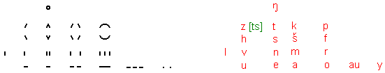
z - straight line, mounting to the right ( = left half of k)
h - straight line, sloping to the right ( = left half of š)
ŋ - curl
au - triple horizontal line
Pronunciation: z like ts (only 1 sound, if spoken well), h with hearable hissing, ŋ like ng in english sing. (As ŋ is difficult to pronounce at the beginning of a word, one might speak a soft g instead of it).
All letters of the 2. column are positioned in the left part of the writing space, they are the left halves of the letters in the 4. column (a,m,š,k). The curl l is as broad as the letters e,n,s and t. The triple line au is the only extra broad letter. This is made clear with an example of a sentence (= scene):

Over a tower with projecting roof (orimauke) a stylized flying bird (hikišizi). On the right of it (in the 2. column of the scene) a space (e). On the right of it (in the 3. column) a child (noŋy).
The above 20-letter-writing already contains 2 signs for dipthongs: au and z (= ts). The sign for au is not the same like the series of the letters a-u, the sign for z (= ts) not the same like the series of letters t-s! Also acoustically there's a difference: The series of the letters a-u is spoken as -aju- (filling consonant j inserted), the series of letters t-s as -tis- (filling vowel i inserted).
The series of letters au-au is spoken as aujau, a-au as ajau, au-o as aujo. But the 3 serieses of letters au-y, au-e, au-a are spoken without filling consonant, simply as auy, aue, aua
Evaluation: The phonetic picture-writing with 12 letters contains the 12 most important signs, that's proven by experience in designing ideograms. It's extensions by 4 resp. 8 signs, that is the phonetic picture-writings with 16 resp. 20 letters, possibly contain the 16 resp. 20 most important letters, but that's not completely sure. The usability of a sign depends on the subject, resp. how many words of a certain subject, e.g. geometry, plants, animals, engineering, chemistry ... are necessary. A single point was a quite useful sign, but is difficult to see in usual printing, it enforces the reader to look careful: So reasons of reading and writing are a hindrance of using a single point as a sign. But one might make the point bigger than a line is thick, and give it additional space before and behind it, then it's readable better. More possible signs you find with the description of some syllable writings.
Always it's desirable that the table of letters is very clear and regular: The alphabet with 12 letters contains 4 sound groups with 3 signs each, which may be arranged as 4 x 3 matrix. The alphabet with 16 letters and that one with 20 letters (shown in this article) are not so regular. But it's better to have useful signs, which are not completely regular than vice versa.
Supposely it was unfavorite if such a letter writing had much more than 20 letters: For then one had to expand the sound set by sounds rather similar to other sounds (e.g. b,d,g are similar to p,t,k) or by sounds, which are difficult to speak one after the other (already the sounds s, š, f, z (= ts) are difficult to speak in unfavorable sequence), or both.
If one wants to have more than about 20 letters, one should not expand the sound set in a unfavorite manner, but use a diphtong- or syllable writing.
The use of the things described here is free